


As a Decorative Chalk Painter specialising in transforming wooden furniture and bringing it back to life, I decided to take my inspiration from Provence. The old town in Nice, Cote D’Azur inspires me the most.
I have been there several times ever since we lived in Paris and it has become our number 1 holiday destination whenever we go home to France to see family.
Below are some pictures of past trips. You will notice the glorious colours of the buildings each different yet complimenting each other nicely. Why would this not work on furniture too?


The story behind my inspiration goes back to where it all started in Buckingham, England when I first started doing this. I liked the concept of Shabby Chic, making outdated run down furniture look french country rustic but I could not understand why most were selling white only pieces. Surely this was an opportunity to be creative and have unique pieces in colours that you would not usually find commercially.
That’s when I decided to be a little different. I saw how white pieces sold so well as people like to follow the crowd and have something their neighbour has but I took a chance. Remembering Nice in France, I decided to paint these pieces below.

Sure enough they took a while to sell. People loved them but could not imagine where to possibly place the small yellow table or the purple coffee table.
I realised then how different we all are. I personally would love a unique piece made with love full of colour and I would jump in head first and give it pride of place and maybe get the rest of my furniture to match it later.
I started with Annie Sloan Chalk paint as there was a stockist nearby and heard it was the best chalk paint out there!
I have never looked back…
The colours really work with the look I want to achieve and it is top quality. I have tried other brands but not happy with the finish. The colour range shouts out Provence!

I have my favourite colours of course which I will show you examples.
EMPEROR SILK


I love the richness of this red and the similarity with the colour of red wine when dark wax is applied shown in both these pieces.

LOUIS BLUE


I use Louis blue very often. It is a very soothing colour and matches nicely with other wooden or plain coloured furniture. The top sideboard is mine now. Originally a tv unit, I loved it so much and realised it fitted perfectly in this space and matched the blue painting we bought in Newport, Rhode Island in the States when we lived in New York. I had bought it to sell but some things are just meant to be.
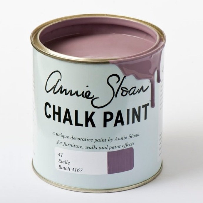
EMILE

COUNTRY GREY


Country grey works well with most furniture. It is a light colour that fits in perfectly in almost every household. A very popular choice for those who want to keep the neutral look but maybe try something different.
OLD OCHRE


The most popular colour. Not white and not cream but slightly darker. Why not!
VERSAILLES


This colour has the wow factor! It is officially green but very light and still bright. I love it! It is noticeable but also plain.
OLD WHITE


Old white works so well on dark wood when you distress the edges to give it that rustic look! It is a vintage white. Slightly see through so you achieve the Shabby Chic effect but definitely looks old and used. I only use it on dark wood though. If you want a perfect white then go for Pure white.
FLORENCE


Omg! What a colour. It is bright and catchy. I personally would paint everything in this colour but not for everyone. If you want a statement piece then this is the one!
ENGLISH YELLOW


What can I say about this one. If you like yellow then yes yes yes! If not choose old ochre. I will let the picture speak for itself. Up to u!
FRENCH LINEN


French linen is soooo popular in the Annie Sloan world. Matches all furniture and very classy! Here you see it on the seat of the Vanity and on cloth of the headboard! Yes you can paint on cloth with Annie Sloan.
And below is a mixture of Florence, Emperor Silk, English yellow and Louis blue. I had fun with this piece and just went for it. It is a crazy look and looks similar to Boho chic or gypsy influence but I feel that this one represents me totally.
Unfortunately these are not very good pictures and do not show the brightness of the Florence and all the colours coming through. Shame as it is sold now.

Was going to tell you about the inspirations I had this summer in France but do not want to overload u with too much so will blog it another time!
By the way, I was nominated for a Liebster Award! How exciting!!! Given to new bloggers who are worthy so, very humbled. That will be my next blog! Until then! A bientot xx
